How to Work With Primary Colors
Primary colors — blue, red and yellow — are the foundations of all
other colors (black and white help with tone and value). But they are
less common in interior design than their derivatives. You see lots of
light yellow and different shades of blue; a ton of green. But you don't see as much of the true shades.
This might be because primary colors in their true forms are often associated with childhood and a floor covered in toys. But there is no reason they have to be babyish. Just ask Mondrian or Miró. Primary colors are the colors of modern art, comic books and pop art.
Primary colors have major impact, especially when they are used together. They are clear, straightforward and bold. You often see them combined with geometric shapes in modern design. But they are most often used in small doses — a painting here, a chair there — or in more muted derivations, like light blue, turquoise, pinks and burgundies.
In modern design, primaries go well with bright white and gray tones. But in other styles they can go a little more wild. You see them sometimes in richly patterned rugs.
Below are some rooms that go all out — primary colors or bust — and some that are more meditations on a theme, with lots of room for interpretation. All of them are brave and beautiful in their own way.
Exteriors
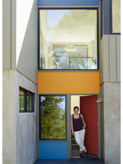
This modern concrete facade looks like a Mondrian painting. The primary color blocks lighten up what could look a little Soviet if left unpainted.
This modern concrete facade looks like a Mondrian painting. The primary color blocks lighten up what could look a little Soviet if left unpainted.
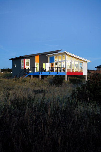
The geometric panels of primary colors (plus orange) glow on this modern neutral home in its vast, neutral landscape.
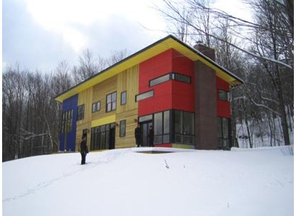
A distinctly modern and vivid take on the cabin-in-the-woods look. The primary colors give the house an artistic look.
True Primaries
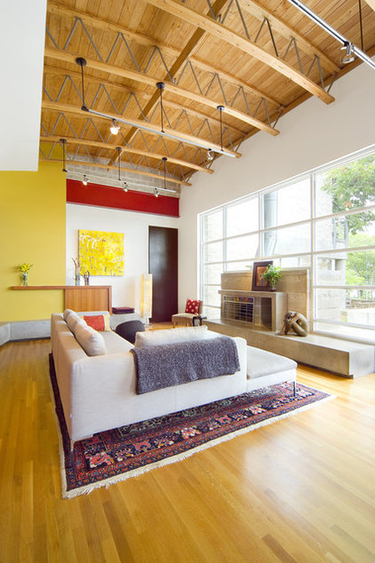
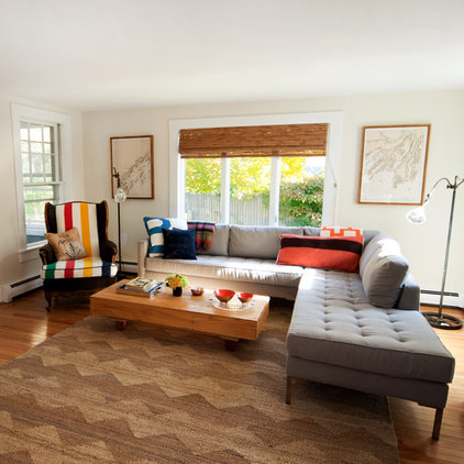
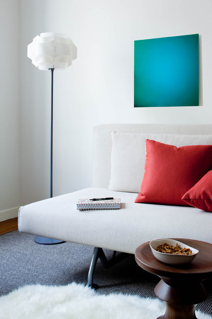
Small areas of true yellow and red warm up a huge room and bring out the color in the wood floors and the area rug. This is a good example of how primary colors don't have to be starkly modern or playroom chaotic.
Small areas of true yellow and red warm up a huge room and bring out the color in the wood floors and the area rug. This is a good example of how primary colors don't have to be starkly modern or playroom chaotic.
I love the small touches of primary colors in this room, all anchored by the blue chair. The look is striking and subtle.
|
They are all here, but they are
not taking over the room. Instead the red, yellow and blue blend into
the rest of the warm decor.
|
|
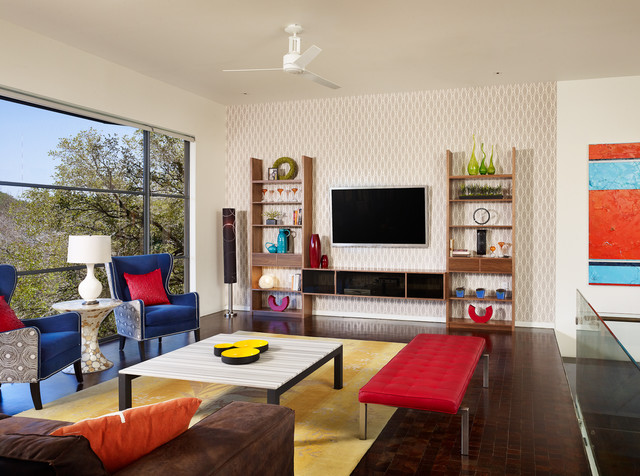
This eclectic room has traditional
elements, like the blue wingback chairs, paired with modern elements,
like the geometric shape of the room and window. It also expands the use
of primary colors by including the turquoise and orange painting.
|
I love this chair.
|
A very modern use of primary colors. Bright white sets it all off, so each piece is a little explosion of color.
|
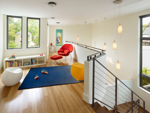
Primaries at their most comfortable: geometric, spare and modern.
by Sarah Ames
by Sarah Ames
Variations on a Theme
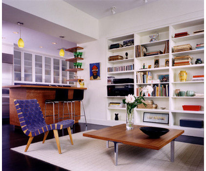
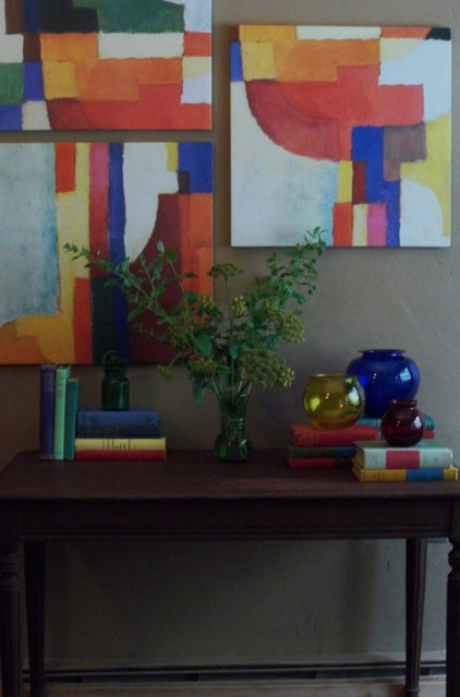
The primary colors in this painting are highlighted by the primary-colored accessories and books on the table below.
The primary colors in this painting are highlighted by the primary-colored accessories and books on the table below.
This brave room is mostly about primary colors, but the decorator has added pink and green and pattern and ... wow.
|
|
|
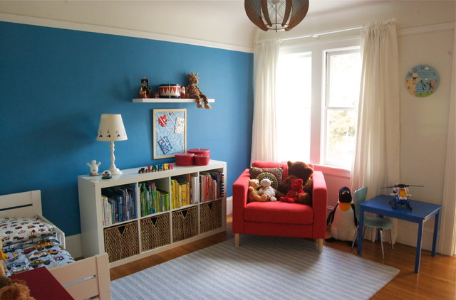
A mellower take on the primary-colored kids' room. Still vivid but slightly subtler than true primaries.
|
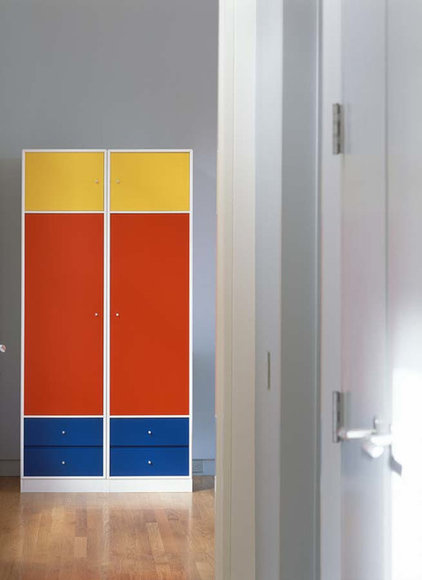
Geometric shapes, bright white, but not quite primary colors. The effect is similar but softer.
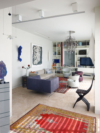
This eclectic room is so gorgeous.
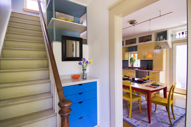
The primary colors are almost hidden in art and rugs and that one small
strip of red on the bookcase. But they are there, in all their stylish
glory.
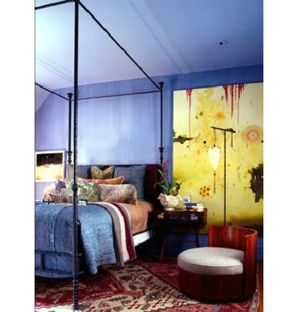
Another beautiful, eclectic take on primary colors.
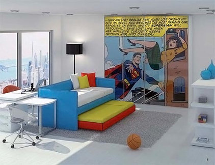
A pop art dream room. Some true primaries, some muted versions, but all "Pow!'
All One Color
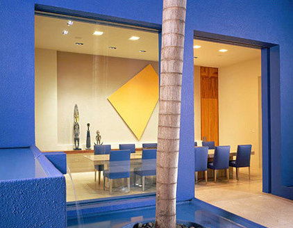
When primary colors are on the walls, they usually go solo. This saturated blue is both modern and Mediterranean. And that bright yellow canvas is the perfect punch. Notice how everything else is extremely simple.
When primary colors are on the walls, they usually go solo. This saturated blue is both modern and Mediterranean. And that bright yellow canvas is the perfect punch. Notice how everything else is extremely simple.
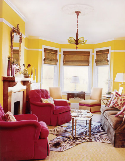
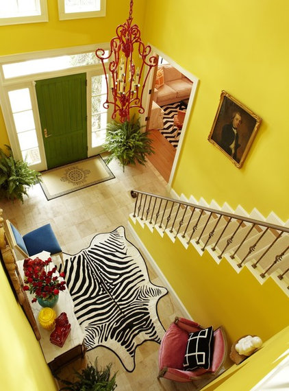
Bright yellow walls. Red chairs. Need I say more?