Keep Calm and Carry On: Going Beyond the Poster

Nature. Even if you
don't have the greatest view of a natural outdoor setting, it's easy
enough to bring a few large branches of interesting leaf forms indoors.
This space went from stark to soothing by the simple addition of leafy
green stems.
by MusaDesign Interior Design

Whenever you can incorporate
nature into your space through a large window, go for it. This softly
colored room has a great view of the subtle textures outdoors. The
rustling leaves will pull you into a captivating state, and all your
troubles will wash away. Well, for a moment, anyway.
by valerie pasquiou interiors + design, inc 
Lighting. With so many
options on the market, it may be somewhat tricky to choose lighting for
your home. But keep the general concept of this ideabook at hand and
narrow down your choices from the get-go. Look for lighting with a
design that's easy on the eyes rather than boxy pendants or ornate
chandeliers.
by John Lum Architecture, Inc. AIA
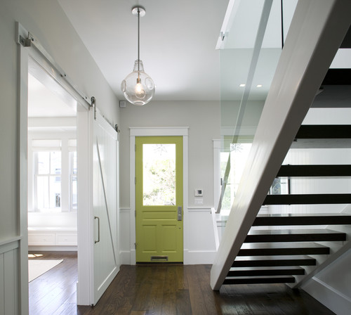
A clear globe pendant is an
excellent choice when looking for something that doesn't distract too
much. Its translucency allows this entryway to maintain its light, crisp
demeanor.
by Feldman Architecture, Inc.
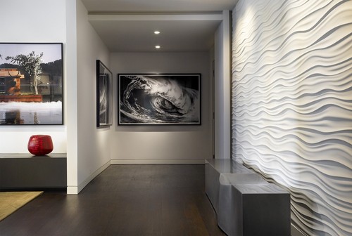
Texture. Flowing
three-dimensional ripples liven this space enough to let this wall
remain blank without feeling unfinished. Organic shapes fit nicely with
the calm and collected theme and add quite a bit of visual interest.
by Turn Collaborative
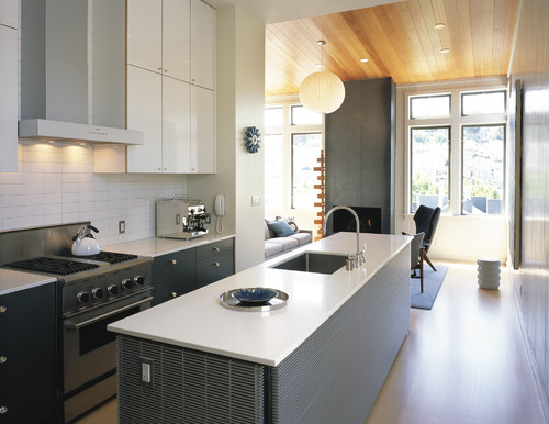
This gorgeous acorn-colored
floor adds visual texture and warmth. The dark, ornate ceiling in the
room ahead balances the color and pulls the eye toward a few more
textural elements. Smooth marble countertops and stainless steel drawer
pulls round it off nicely.
by Van Wicklen Design

Softness. Enveloped by
dark color and delicate lighting and backed by velum-like shades, this
window seat is a smooth talker. The plush cushions and chunky blanket
pull it all together, and before you know it, nap mode is in full force.
by nytimes.com
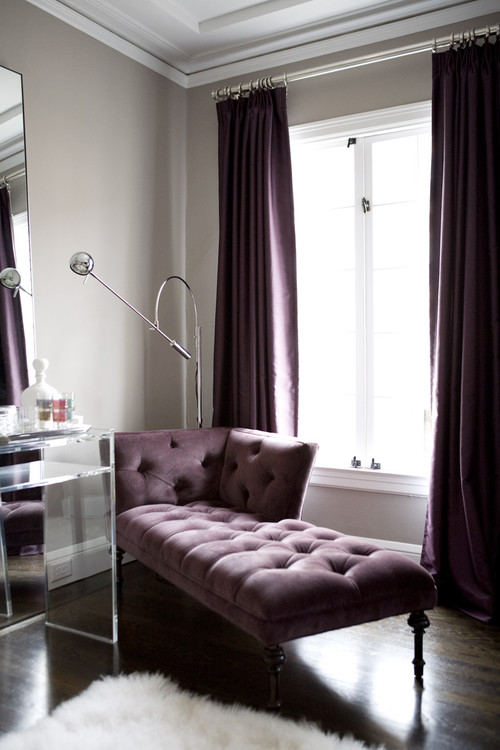
A gentle and comforting chaise
is the perfect retreat after a long day at the office. With solid drapes
and a tufted chaise wrapped in eggplant, this space is easy on the
eyes. The acrylic desk provides flow and the white flokati rug seals
this off as a package deal.
by Amoroso Design

Cohesive color. A
thoughtfully composed living room provides a peaceful vibe by using a
minimal color scheme throughout. Black seems to be a color that many
people avoid, but this room holds it high with ease. When using a strong
color such as black, it's important to maintain color balance
throughout the room so the weight doesn't fall to one side.
by The Couture Rooms
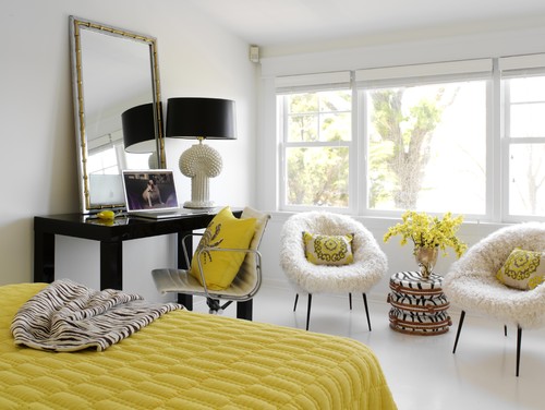
This relaxed bedroom is a great
example of how a color that's just a little more vibrant can be used
while still providing a laid-back atmosphere. The soft yellow acts much
like a neutral, and all the use of texture is amazing.
by Tara Seawright
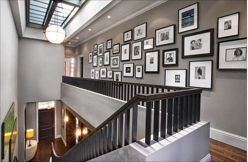
Repetition. A
photo-covered hallway doesn't feel cluttered or chaotic, thanks to
black-and-white photographs and frames of the same color. The lack of
symmetry on the wall keeps this long hallway from feeling too rigid,
which would most likely be the case if the frames were displayed in a
grid.
by Dumican Mosey Architects
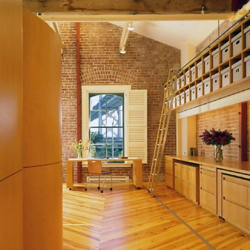
Another great example of
repetition, this warm, character-heavy room has both the floor and long
row of bins going for it. It carries the eye with ease and represents a
nice, calming flow.
by BraytonHughes Design Studios
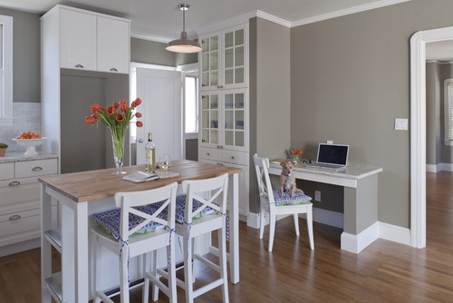
Neutral colors. So maybe
I'm stating the obvious, but an ideabook about creating a calm
atmosphere would not be complete without the mention of neutral hues.
These soft colors are easy to work with and provide a quiet and serene
backdrop, allowing an overly busy mind to catch up on rest.
by Suzie Parkinson
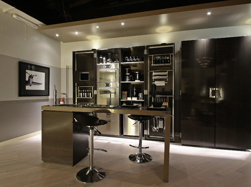
- This classy bar will sway visitors into smooth conversation. With a gradient of color on the wall, the room is anything but boring. Chrome details make the space feel crisp rather than dull — always something to consider when using hues in this range.