Design Lessons From a 10-Foot-Wide Row House
Most of us have that one tricky area in our home that
seems impossible to design around. Long walls, narrow hallways, tight
corners, no windows — these can be devilish little challenges. But architect
Richard Loosle didn't have just one tricky room to fix. He had an
entire house full of them: a two-story, 900-square-foot row house only 10 feet wide.
The home, which dates back to the mid- to late 1700s and was likely used as housing for servants, is in Washington, D.C.'s historic Foggy Bottom neighborhood. Loosle's clients, a family of four from Libya who travel to the U.S. capital for business, were tired of staying in hotels every time they came to town. They bought the falling-apart row house to turn it into a part-time home.
But the house had had only moderate renovations, the last of which occurred 50 years ago. Meanwhile, with such a narrow space, the house was dark and cramped. It was Loosle's task to open it up and make it comfortable.
Houzz at a Glance
Who stays here: A couple who most of the time lives in Africa with their 5-year-old twins
Location: Foggy Bottom neighborhood of Washington, D.C.
Size: 900 square feet; 2 bedrooms; 1½ bathrooms
Cost: More than $500,000
|
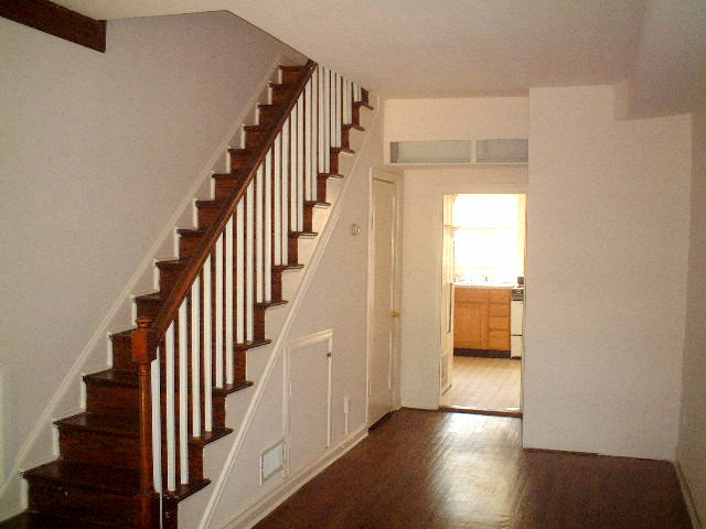
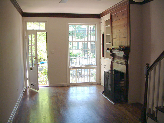
Uneven floors were only the beginning of the home's problems. Loosle
gutted the house, removed walls to open it up from end to end and
replaced the plumbing, electrical and mechanical elements. This gave him
an opportunity to maximize the 10- by 40-feet interior. “I’d done row houses before, but not as narrow as this," Loosle says. "This is the most narrow you can get.”
|
|
How to Tackle a Tight Space
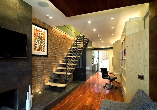
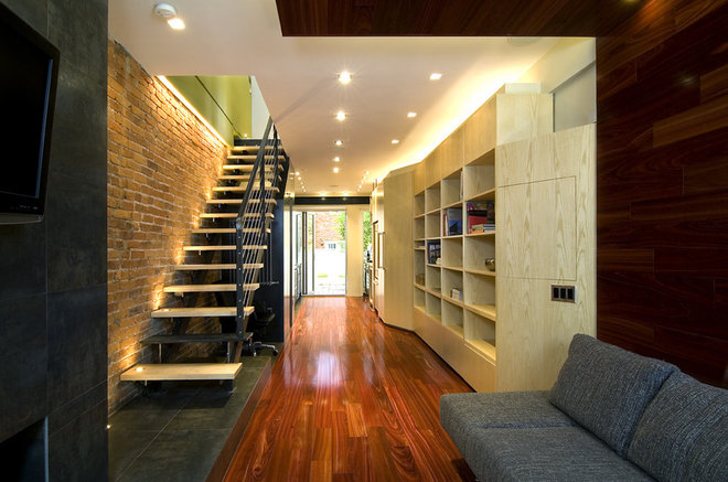
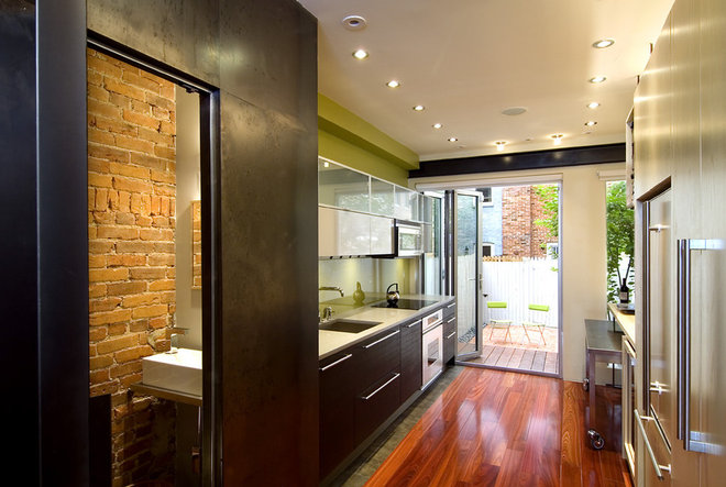
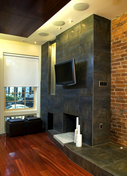
Part the sea. In a row house, the only windows are at the front and back. To make the space feel bigger, the best thing to do is open it up to those natural light pockets as much as possible. For Loosle, this meant he had to push all the solid stuff to either side of the house. One side became the “cold side,” he says. Dark porcelain tile that looks like steel covers the fireplace and a 2-foot-wide strip of flooring. The stairs are steel with a cable railing; steel panels wrap the powder room under the stairs. On the “warm side," a light ash-wood custom storage unit extends along the wall. Warm bloodwood wraps from the floor up a side-wall portion and becomes a drop-down ceiling panel to define the living room. After the plaster was removed, only the lower portion of the brick wall was in decent shape. Loosle covered the top part in green painted drywall. |
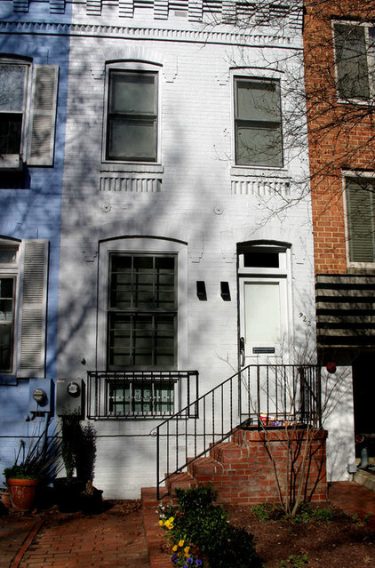
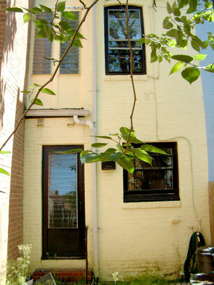
Historic building codes restricted what Loosle could do to the front exterior. He painted it gray, put in new sconces, replaced the windows, took the shutters off and put in low-maintenance landscaping.
“That’s pretty much all you can do,” he says. “The historical association doesn’t care what you do on the inside, though.”
“That’s pretty much all you can do,” he says. “The historical association doesn’t care what you do on the inside, though.”
|
Focus on storage. But if it's not done right, the walls can start to feel like they're closing in.
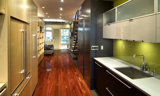
The ash unit starts at the entrance, beginning as a closet, then ducks behind the bloodwood paneling before popping out from the wall to form a bookcase, then to a slide-out desk before turning into a coat closet and pantry. It then wraps around the refrigerator and finally ends up as a horizontal butcher block table. “It’s one unit, but it changes in function for a lot of storage and flexibility for tall stuff, short stuff, computer stuff and kitchen stuff,” Loosle says. The unit stops just below the ceiling to give the appearance of more height in the space, despite the 8-foot ceilings. “You have to be smart when creating a lot of storage to not make the space feel smaller,” he says. Flip the switch. Loosle incorporated a lot of artificial light through numerous sets of LED lights on dimmers across the ceiling, above storage units and up the staircase. But the most effective move was opening the house to the windows on the front and back walls. |
|
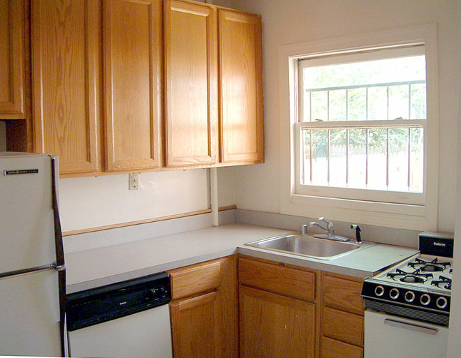
Loosle says the kitchen had probably last been updated sometime in the 1960s.
|
|
Smartly hide everything.
Loosle pulled everything off the back wall and installed a folding
NanaWall to connect the space to the back patio and bring natural light
in.
The kitchen sink, cooktop, oven and microwave are all on one side of the house. Two rows of cabinets above provide a decent amount of storage. The fridge, a pullout pantry and a horizontal piece of butcher block that acts as additional counter space forms the opposite side. The homeowners can pull the steel table out for dining, move it into the living room or use it as extra desk space. There’s also a wine cooler and a sound system that pipes music into the whole house. “There’s a lot of high-end stuff packed in here and nicely hidden,” Loosle says. To get natural light into the steel-covered powder room, at left in this photo, Loosle let the stairs form a portion of the ceiling, with frosted glass to bring light in from the front windows. Sink: Catelano; kitchen: New York Loft |
|
Porcelain tile beneath the kitchen counters creates a drip edge so water doesn’t spill onto the bloodwood. The backsplash is glass painted green.
|
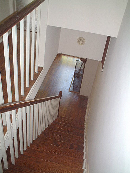
Thick stair railings once made the staircase feel closed off.
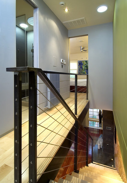
Less is more. Now cable railings create the appearance of more space. "They almost disappear," Loosle says.
Think vertically. A dark gray ties the house together vertically with color. The green backsplash from the kitchen extends to the second-floor wall, and the front and back interior walls are the same color on both levels. It's a way to connect the house vertically and add volume. “We’re talking about planes of color and materials and not just rooms,” Loosle says.
Think vertically. A dark gray ties the house together vertically with color. The green backsplash from the kitchen extends to the second-floor wall, and the front and back interior walls are the same color on both levels. It's a way to connect the house vertically and add volume. “We’re talking about planes of color and materials and not just rooms,” Loosle says.
|
Work your materials. The main bedroom is directly above the living room, so below the floor
is that bloodwood drop-down ceiling in the living room. The idea here
was for that element to symbolically become the base of the custom bed,
which is ash wood stained to match the bloodwood below.
Deep drawers create storage underneath. Maple wood wraps the wall to become the headboard, instead of having one extend from the wall, which saves space and makes the room feel taller. “In a traditional world you’d divide the wall up with chair rail, baseboard and crown molding," Loosle says. "We want things as simple as possible, so it feels taller. We also like to treat rooms with different materials. If all the walls were wood or all blue paint, it’d feel closed in." |
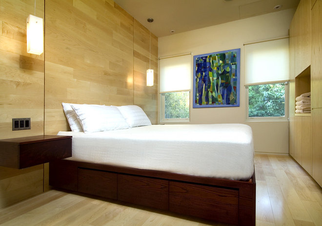
Steal the sunshine. A wall of built-in storage holds a TV and a desk in the main bedroom. This unit also stops just below the ceiling.
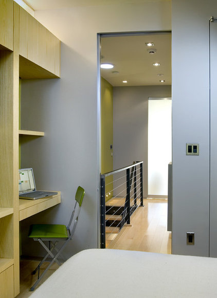
The bedroom doors are metal frames with frosted glass to let light from windows on the front and back sides come through them and into the hallway.
The larger round light above the stair landing is actually a solar tube that brings sunshine down. “All the light is on either end, in the bedrooms," Loosle says. "With the glass on the doors and solar tubes, you never feel like you’re in a dark hole.”
Embrace modern design. Modern
design turned out to be the perfect style for the compact house. Modern
fixtures tend to be slimmer; traditional heavy wood and thick metal
would have looked clunky.
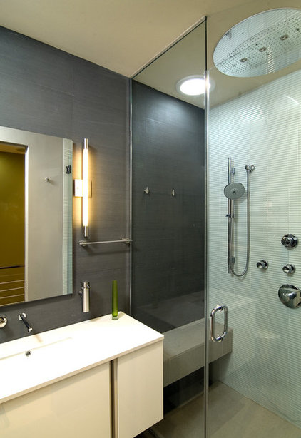
Another solar tube brightens the main bath. One way Loosle worked to make the room feel bigger was to vary the tile and paint. Dark tile on the back feels sophisticated; light tile on the floor and glass in the shower help reflect the natural daylight coming in.
Another solar tube brightens the main bath. One way Loosle worked to make the room feel bigger was to vary the tile and paint. Dark tile on the back feels sophisticated; light tile on the floor and glass in the shower help reflect the natural daylight coming in.
|
|
Get the magic touch. A push on some of the fireplace panels reveals storage behind them. Small footstools and seats conceal even more storage.
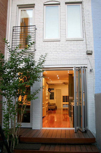
The glass NanaWall connects the interior to the rear ipe patio. It also helps pull more light into the house.